
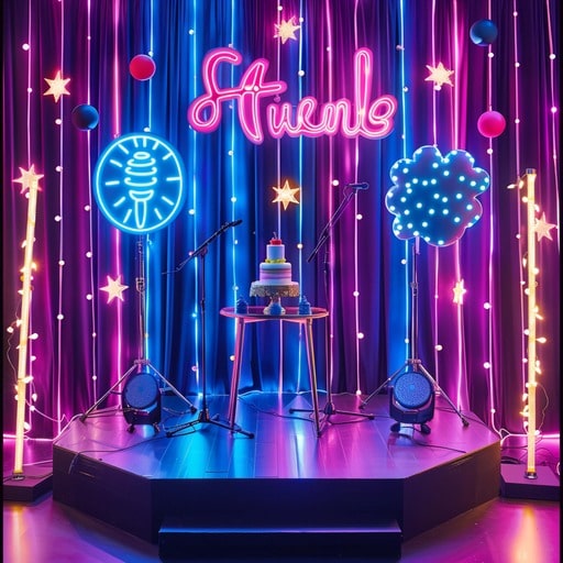
Yesterday, I was browsing some design forums and stumbled upon the “carnival neon” trend. Sounded cool, so I decided to give it a shot and see what I could come up with.
Getting Started
First things first, I needed some inspiration. I spent a good hour just scrolling through images of carnival signs, neon lights, you name it. I wanted that vibrant, almost chaotic energy in my design.
After gathering some reference photos, I fired up my trusty design software. I usually just go with whatever feels right. I began with a dark background, because, let’s be honest, neon glows better against darkness, right?
Playing with Colors and Shapes
Next up: colors! I chose a palette of super bright pinks, electric blues, and some vibrant yellows. The key is to make them clash a little, just like a real carnival.
I started creating some basic shapes – circles, stars, maybe a few squiggly lines to mimic that classic neon tubing. It was all about layering. I put some shapes behind, some in front, adding some glow effects here and there to,well, make them glow.
Adding the “Neon” Effect
- Outer Glow: This was crucial. I cranked up the outer glow settings on each shape, experimenting with different blend modes and opacities until it looked like actual light spilling out.
- Inner Glow: Adding a subtle inner glow helped to give the shapes some dimension, making them look less flat.
- Blur: A little bit of blur on some of the elements softened the edges and made the “neon” look more realistic.
I spent a good chunk of time just tweaking these settings. It’s amazing how small adjustments can make a huge difference. My eyes started crossing after a while, but I had to get that glow just right!
Adding Some Text
No neon sign is complete without some text! I picked a bold, slightly retro font – something that looked like it belonged on a vintage arcade machine. I applied the same neon effects to the text as I did to the shapes. It tied everything together nicely.
Finishing Touches
Finally, I added some extra details. I added a few “flickering” effects by duplicating some elements and changing their opacity. I did a few things a couple of times. I even threw in some random sparkles and light bursts for extra flair. It was all about capturing that chaotic, energetic carnival vibe.
Overall, it was a fun experiment! It took longer than I expected, The final result? A vibrant, eye-catching design that totally screams “carnival neon.”
