Lately, I kept seeing Pantone Turquoise Blue popping up everywhere – fashion magazines, interior design pages, even my kid’s art project. Got curious why this specific shade felt so trendy. Grabbed my sketchpad and coffee, ready to dig in.
Starting With the Basics
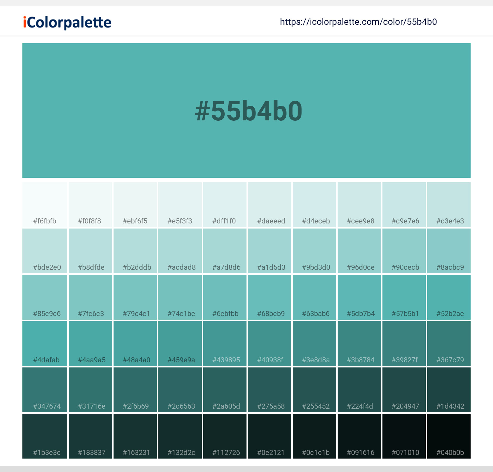
First, I searched Pantone’s official stuff. Found out Turquoise Blue (their code 15-5519) is supposed to feel calm and refreshing, like tropical oceans. Honestly, sounded vague. How’s this different from regular teal or aqua? Neighbors used it in their living room last year – called it “seafoam something.” Totally different vibe though.
Went physical next. Drove to the art supply store, bought tubes of acrylics named “Turquoise” from three brands. Mixed ’em on scrap paper side-by-side. One looked like mint toothpaste, another like faded jeans. None matched Pantone’s sample. Annoying.
Testing Real-Life Combos
Decided to paint swatches on my garage wall (wife rolled her eyes). Tried pairing it with stuff:
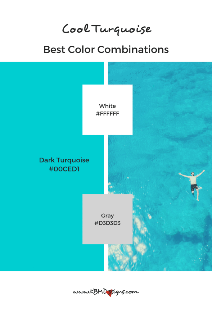
- With yellows: Felt like a beach towel – too cheerful.
- With grays: Got icy. Like a dentist’s office.
- With burnt orange: Boom. Suddenly looked expensive. Like Moroccan tiles.
Realized lighting screws everything. Morning sun made it vibrant; evening bulbs turned it dull green. Took photos – colors never matched reality. Tip: Always check swatches in YOUR room’s light.
Why This Shade Works Now
Remembered that psychology book on my shelf. Turquoise Blue sits between blue (trust) and green (growth). Makes sense why brands use it post-pandemic – subtly says “we’re safe but moving forward.” Sneaky.
Used it in a client’s cafe menu redesign last month. Replaced their aggressive red with Turquoise Blue accents. Regulars actually commented it felt “less rushed.” No kidding – color impacts mood for real.
Final tip? Don’t force it. Slapped it on my website header last week. Clashed with everything like a neon sign. Back to navy blue for now. Maybe turquoise works best as surprise pops – pillows, mugs, that one wall. Still figuring it out, honestly.
