

So, I found myself staring at this big brown sofa I got. Solid piece, really comfy, but man, it just kinda sat there, looking… brown. I needed to figure out what colors would actually liven things up without clashing horribly. It wasn’t as easy as I thought it’d be.

My Little Color Quest
First thing I did was just eyeball it. What did I think might work? My first instinct was maybe just more brown? Like, different shades? Nah, that felt kinda dullsville. Too much of one thing, you know? Then I thought, okay, maybe just plain white? Crisp and clean, right? So, I grabbed some white cushions I had lying around and tossed them on. It was… okay. A bit stark, honestly. Didn’t feel cozy, which is what I wanted for the living room.
Alright, plan B. I started thinking about where you see brown naturally. Trees, earth, that sort of thing. What colors do you see there? Green leaves, blue sky, maybe some reddish earth tones. That felt like a better direction. I actually went outside, walked around the park nearby, just looking. Sounds silly, maybe, but seeing the brown tree bark against the green grass and leaves, or against the blue sky – it clicked.
Back inside, I pulled out some old paint swatches I had from a previous project. Found a nice muted green, sort of sage-like. Held it up near the sofa. Better! Much better. Felt calmer. Then I tried a blue, not a bright blue, but more of a dusty, grayish-blue. That worked too, felt sophisticated somehow.
I got a bit bolder then. Remembered seeing some terracotta pots that looked great against dark wood. So, I dug out a rusty, orangey-red swatch. Placed that next to the brown sofa fabric. Wow, okay, that added some real warmth, some energy. Didn’t expect to like it that much, but it gave off a nice, earthy vibe.
What Actually Worked for Me
So, after all that messing around, here’s what I personally landed on that felt right with my brown sofa:

- Cream or Beige: Yeah, I know, sounds basic. But softer than stark white. It just blends nicely, keeps things light without being harsh. I used this for the walls eventually. It provided a nice, soft background.
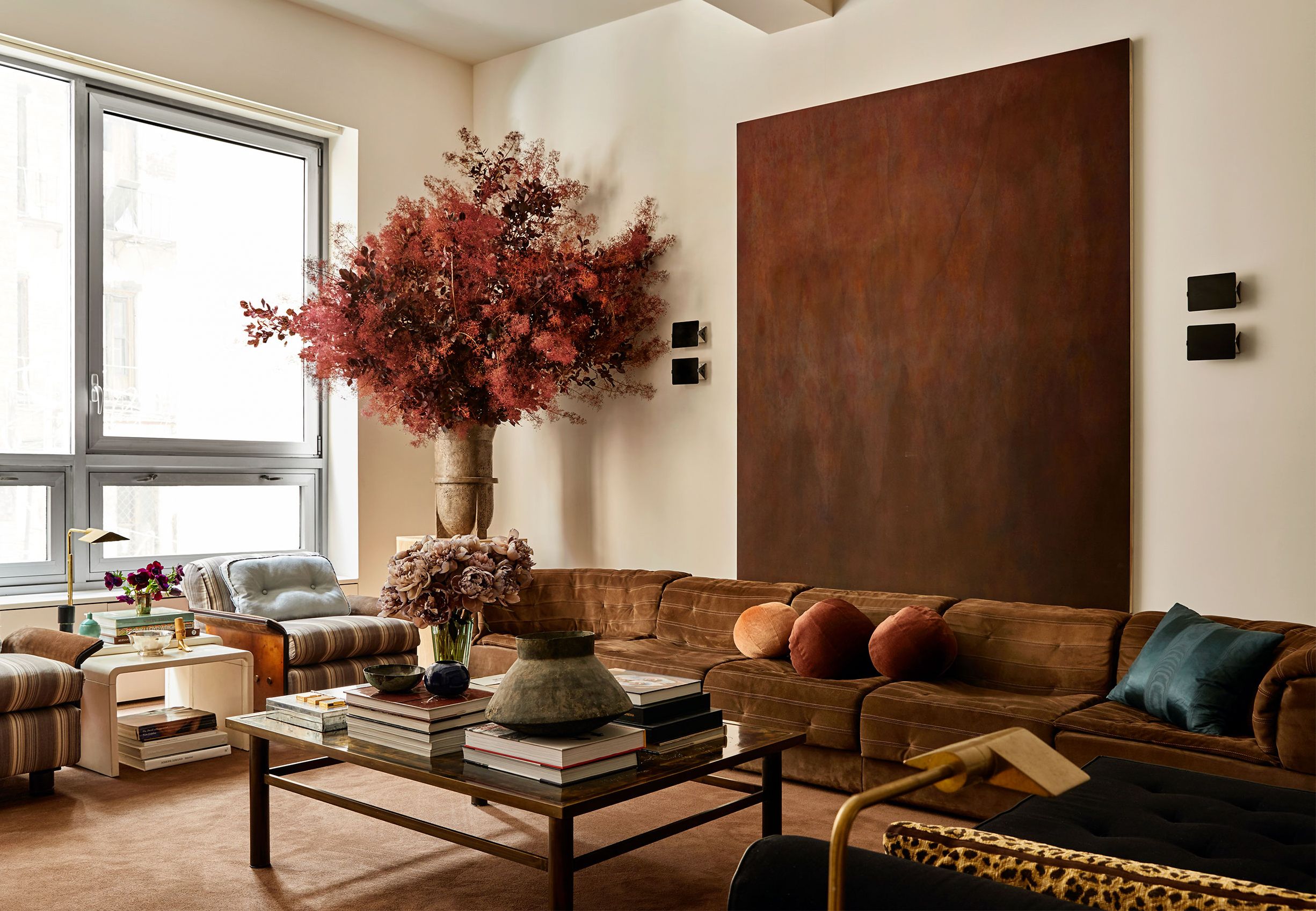
- Blues (especially muted or teal): This was a winner. I got some throw pillows in a deep teal and a couple in a lighter, grayish-blue. It made the brown feel richer, less boring. Created a nice contrast.
- Greens (earthy ones): Sage green, olive green, even a muted forest green. Brought that nature feeling indoors. I added a couple of plants and a green throw blanket. Felt very grounding.
- Warm Terracotta/Burnt Orange: Used this sparingly, like in a vase or a pattern on a rug. It really popped against the brown, made the space feel warmer and more inviting.
- Soft Pinks (surprisingly!): Didn’t think this would work, but a dusty rose or a muted blush pink actually softened the brown. Tried a small pink decorative box on the side table, looked quite chic.
- Gold or Brass Accents: Not exactly a color, but metallic finishes. I swapped out the handles on a nearby cabinet for brass ones, and added a lamp with a gold base. Really elevated the look and went great with the brown.
In the end, my living room felt way more put-together. The brown sofa became this nice, warm anchor point instead of just a big brown blob. It took some trial and error, moving swatches around, trying different accessories, but figuring out those color combos made all the difference. Brown’s actually pretty versatile once you start playing around with what goes next to it.