
Alright, let’s dive into this “missguided branding” thing I messed around with. It was more like a weekend project that spiraled a bit, you know how it goes.
The Start: Just Playing Around
So, I was scrolling through Pinterest, just killing time, and I stumbled upon some really bold, in-your-face branding. Missguided popped up, and I thought, “Hmm, their visual identity is kinda… all over the place.” Not bad, just not super consistent. That’s when the gears started turning. I figured, why not take a crack at it, see if I could tighten things up a bit?
First Steps: Research & Mood Board
I started by digging around. Looked at their website, their social media, even tried to find old campaigns. I wanted to get a feel for their target audience – young women, trendy, not afraid to experiment. Then, I threw together a mood board. Lots of bright colors, edgy fonts, and images that screamed “confident and fun.” Think neon signs, bold typography, and photos that felt real, not overly polished.
Font Fun: Choosing the Right Typeface
Font selection was crucial. I wanted something that felt modern but also had a bit of an attitude. I ended up settling on a couple of options: a strong, sans-serif for headlines and a slightly softer, more playful font for body text. The idea was to create a balance – bold but approachable.
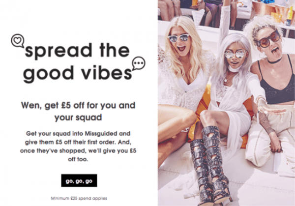
Color Palette: Keeping It Fresh
Missguided already uses a lot of pink, which is fine, but I wanted to add some depth. So, I built a palette around a core pink, then added some contrasting colors like a vibrant teal and a sunny yellow. These accent colors were meant to pop and keep things interesting.
Logo Time: Simplifying the Core
Their logo wasn’t terrible, but I felt it could be cleaner. I messed around with a few different versions, trying to simplify the shapes and make it more versatile. I ended up with a slightly condensed version of their existing logo, making it look more modern and suitable for different media.
Putting It All Together: Mockups, Mockups, Mockups
This is where the real work began. I started creating mockups – website headers, social media posts, even some packaging concepts. This helped me visualize how the new branding would look in the real world. It was a lot of trial and error. Some ideas looked great in my head but fell flat when I actually mocked them up.
Challenges & Tweaks
The biggest challenge was balancing the “edgy” vibe with the need for clarity. I didn’t want the branding to be so out-there that it became confusing or inaccessible. There were a few times where I had to pull back on the more extreme elements and make sure the overall message was still clear.
The Final Result: A More Cohesive Look
In the end, I came up with a branding concept that felt more cohesive and modern. It still captured the fun, confident spirit of Missguided, but it did so in a way that felt more intentional and consistent. I’m not saying it’s perfect, but it’s a solid direction, and I learned a ton during the process.
What I Learned: Branding is More Than Just Pretty Colors
This little project reminded me that branding is more than just picking cool colors and fonts. It’s about understanding a brand’s values, target audience, and overall message, and then translating that into a visual language. It’s a continuous process of refinement and adaptation.
- Research is key. You can’t create effective branding without understanding the brand inside and out.
- Don’t be afraid to experiment. Try out different ideas, even if they seem a little crazy at first.
- Get feedback. Show your work to others and get their opinions.
