
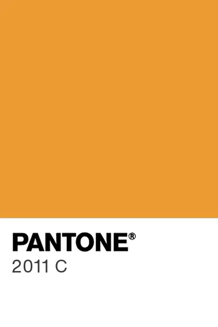
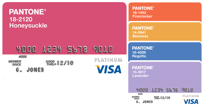
So I was cleaning out my closet last weekend and found this dusty Pantone color guide from like 2010. Remembered they pick a Color of the Year every year, so I googled what the 2011 one was. Turns out it’s called Honeysuckle – this crazy bright pinkish-red that looks like tropical flowers. Honestly my first reaction was “whoa that’s intense!”

Playing with the Color
Grabbed some paint swatches from the hardware store to compare. Honeysuckle sits somewhere between bubblegum pink and raspberry jam – really pops next to neutral stuff. Mixed a sample pot myself using:
- Basic white base paint
- Red toner (way more than I thought)
- Tiny splash of purple to deepen it
Took three tries to match it right – kept coming out too orange or too neon. Pro tip: natural light matters BIG time with this shade.
Testing in My Space
Painted big sample squares on different walls in my apartment:
- Bedroom accent wall: Felt like waking up inside a watermelon. Too aggressive.
- Bathroom trim: Actually kinda fun with white tiles
- Kitchen backsplash: Total disaster with my ugly countertops
Best spot ended up being inside my boring bookshelf. Painted the back panels and boom – my books suddenly looked expensive.
Modern Ways to Use It
Since full walls feel dated now, I tried subtle touches:

- Spray-painted old lamp bases
- Got velvet pillows in similar hue
- Printed some Instagram pics with Honeysuckle filters
Works amazing as tiny pops against grays or navies. My favorite? That lamp on my desk makes me smile every morning with its cheerful vibe.
The Real Surprise
Here’s the funny part – when I posted these experiments online, my 60-year-old aunt DM’d me saying “Oh honey that’s just like my prom dress in 1973!” Apparently retro colors really do cycle back. Still deciding whether to tell her she was technically 38 years ahead of Pantone.