")
Okay, so I’ve been meaning to get into this “max bill” thing for a while now. I kept seeing it pop up, and it looked pretty cool, all minimalist and clean. So, I finally decided to give it a shot.
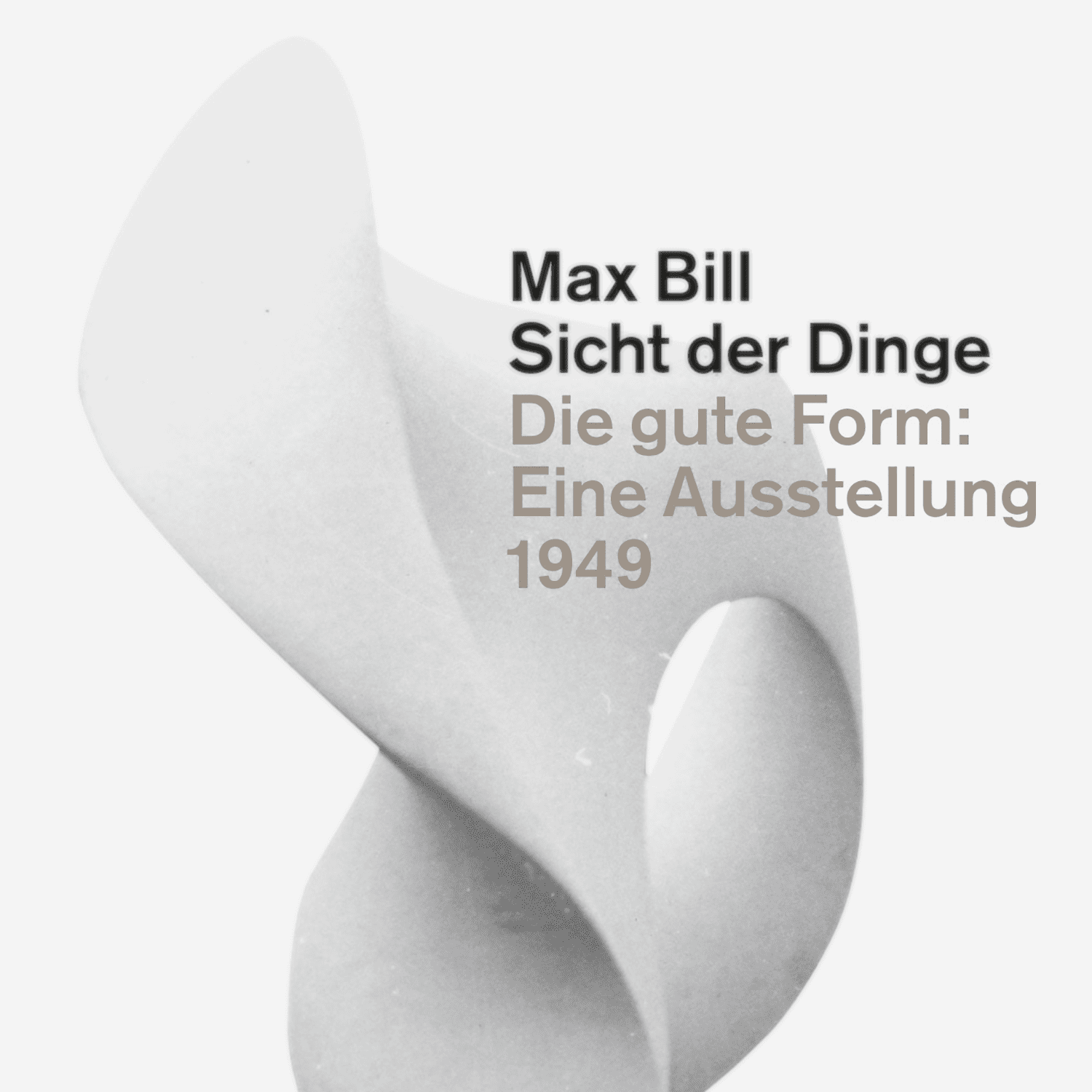
First, I did what anyone would do – I Googled it. I wanted to know, like, what even is max bill? Turns out, he was this Swiss dude, an architect, artist, designer… a whole bunch of stuff. And he had this really specific style.
So, I started by just looking at a bunch of his work. Lots of his clock designs, his posters, his sculptures. Just trying to get a feel for the vibe, you know?
- I spent a good hour just scrolling through images.
- I saved a bunch of stuff that I thought looked interesting, stuff I could maybe try to recreate or get inspired by.
Then, I decided to try and make something myself. I figured I’d start simple, so I grabbed some basic shapes – squares, circles, triangles. I opened up my usual design program (nothing fancy, just something I’m comfortable with) and started messing around.
My First Attempt (It Was Rough)
My first try? Honestly, it was pretty bad. I was trying to copy one of his posters, but it just looked… off. The colors were wrong, the spacing was weird, it just didn’t have that “max bill” feel. I think I spent like, two hours on it, and it was just a mess.
I didn’t give up though! I went back to the images I’d saved, looked at them some more, and tried to figure out what I was doing wrong. I realized I was being too… complicated. Max bill is all about simplicity, and I was overthinking it.
Trying Again (and Again…)
So, I started over. This time, I focused on just a few basic shapes, and I really paid attention to the colors. I used a color picker tool to grab the exact colors from one of his posters. I also focused on the spacing between the elements – making sure everything was evenly distributed and balanced.
It took a few more tries, and a lot of tweaking, but I finally started to get something that looked… decent. It wasn’t perfect, but it was definitely closer to the max bill style. I felt like I was finally starting to understand what made his work so unique.
It’s still a work in progress, for sure. But I’m having fun with it, and I’m learning a lot. I think that’s the most important thing, right? Just keep practicing, keep experimenting, and keep learning. I will share better result next time, I hope.
